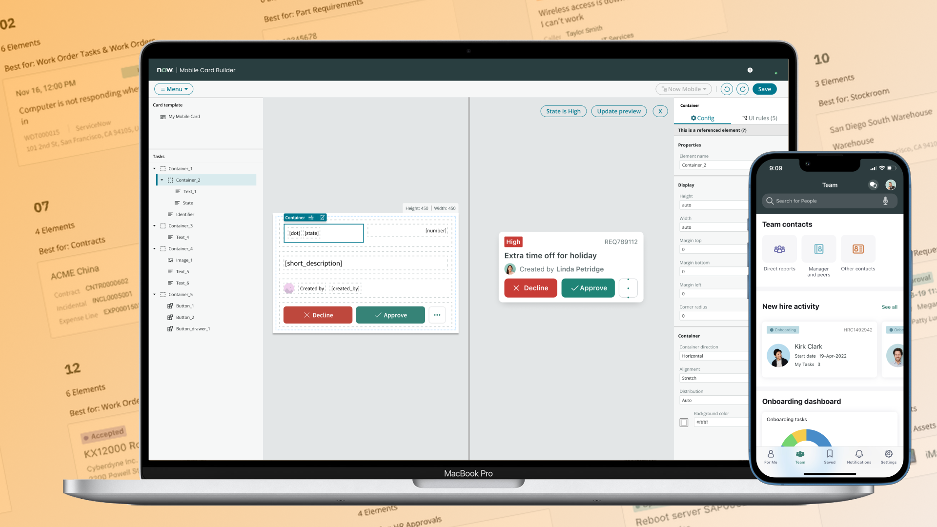
Mobile Developer Platform · Part 1 of 3 · Entry point
Turned a P1 bug into a new product, cutting card configuration from 75 minutes to 16 minutes and proving the stack, team, and patterns every later mobile builder inherited.
ServiceNow · 2019 - 2020 · first designer on the mobile developer platform; proposed Mobile Card Builder and carried its design from 0→1
The problem nobody owned
I joined as the first designer on the mobile developer platform. In my first few weeks speaking to developers and conducting a heuristic evaluation of our configuration tool Mobile Studio, key themes emerged: confusing terminology, broken navigation, and a bug that overwrote people's work.
That bug was a P1. The tool was sold as a no-code solution, but to customize a card, developers had to hand-edit JSON in system records, and reopening the tool afterward corrupted what they'd built.
Our product team owned the patterns, a separate engineering team owned the JSON schema, and a separate remote engineering team kept refactoring the mobile platform architecture underneath both.
Our target users are ServiceNow Developers. They work across those 3 areas frequently, and when the release cycle occurs every 6 months our team put resourcing to absorbing broken code instead of building what customers asked for.
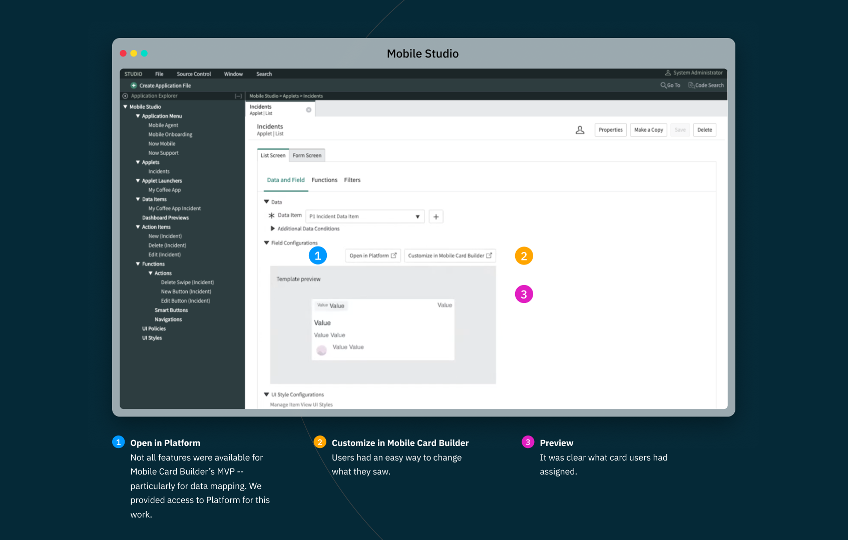
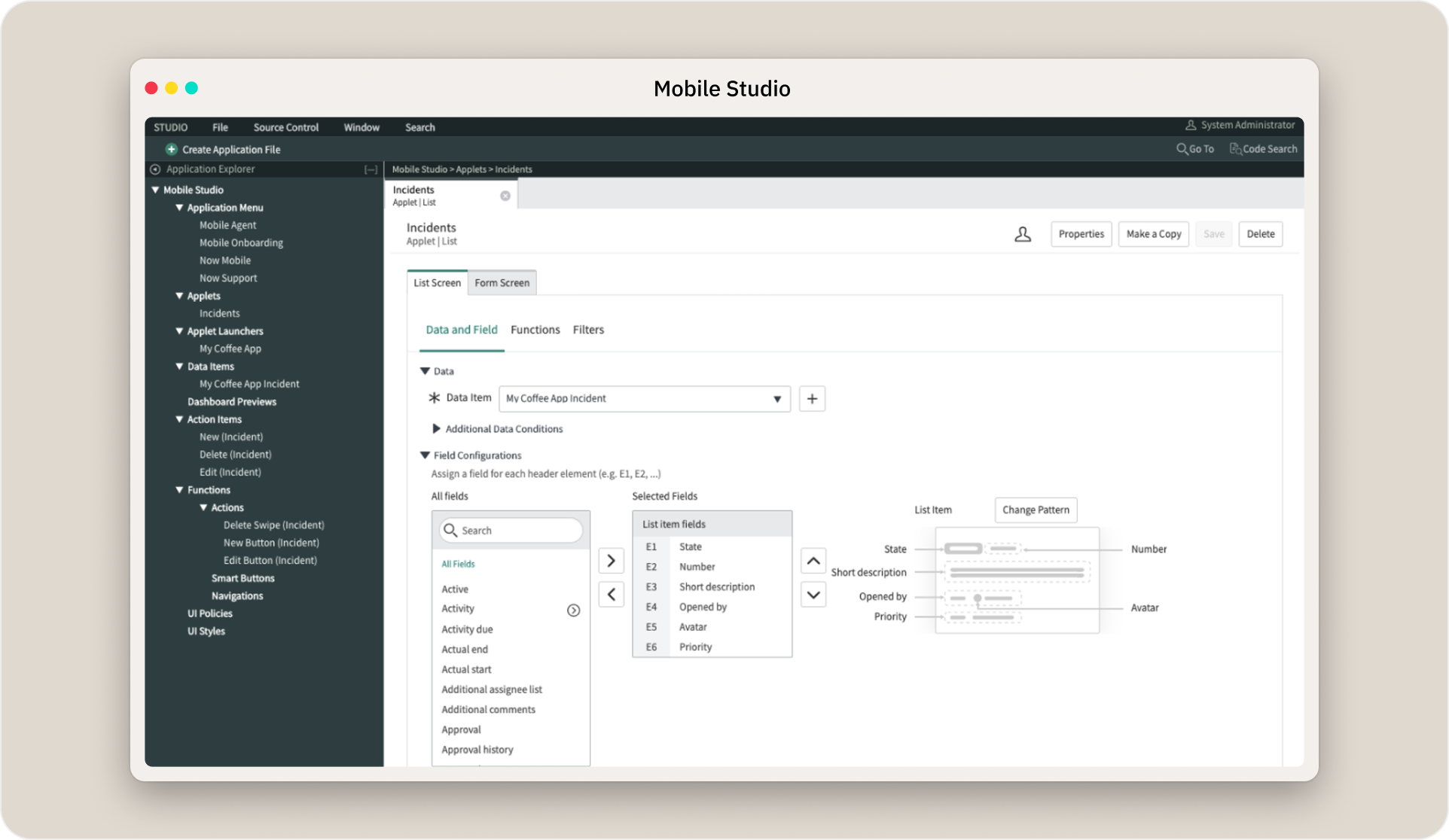 Users within Mobile Studio want to customize the appearance of cards in a list screen.
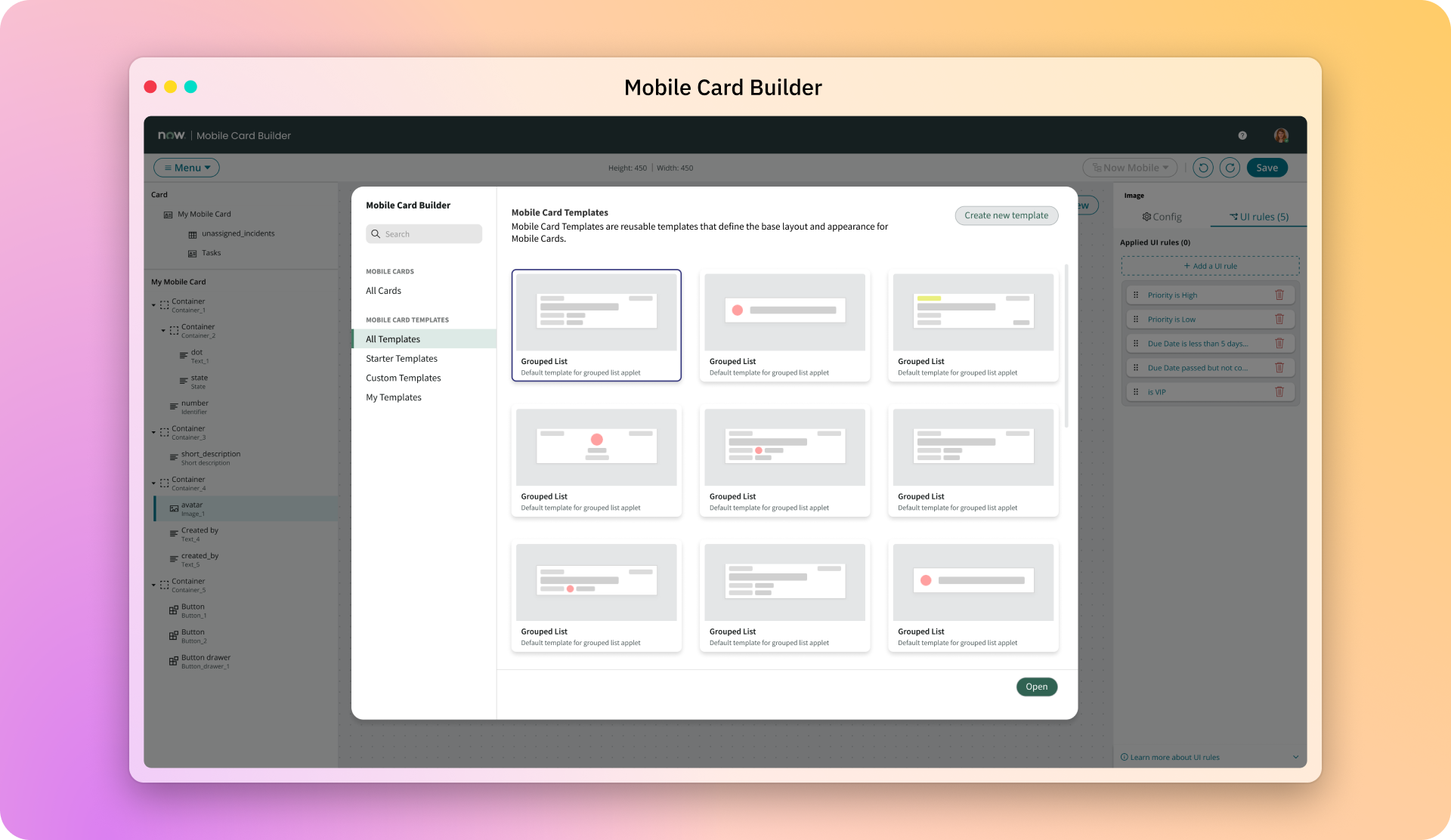
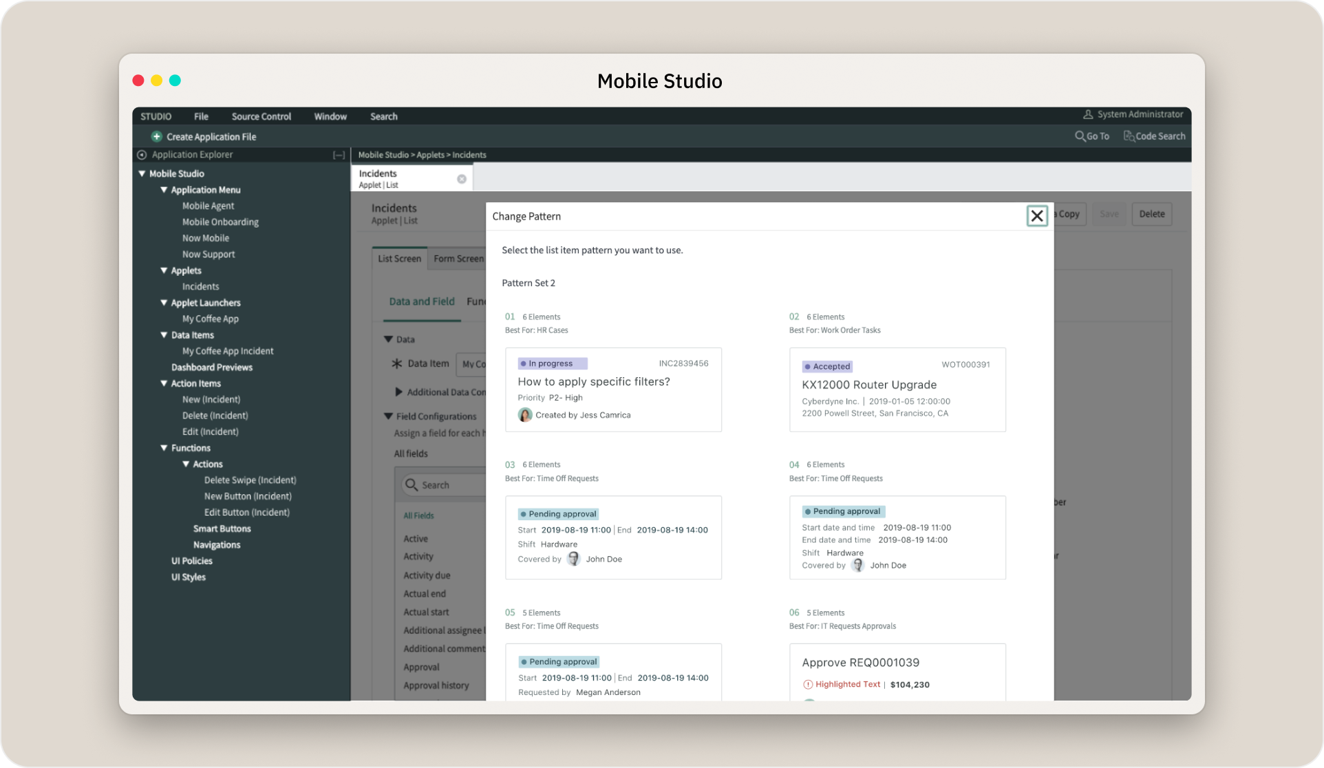 Opening the patterns library presents 80 patterns to choose from.
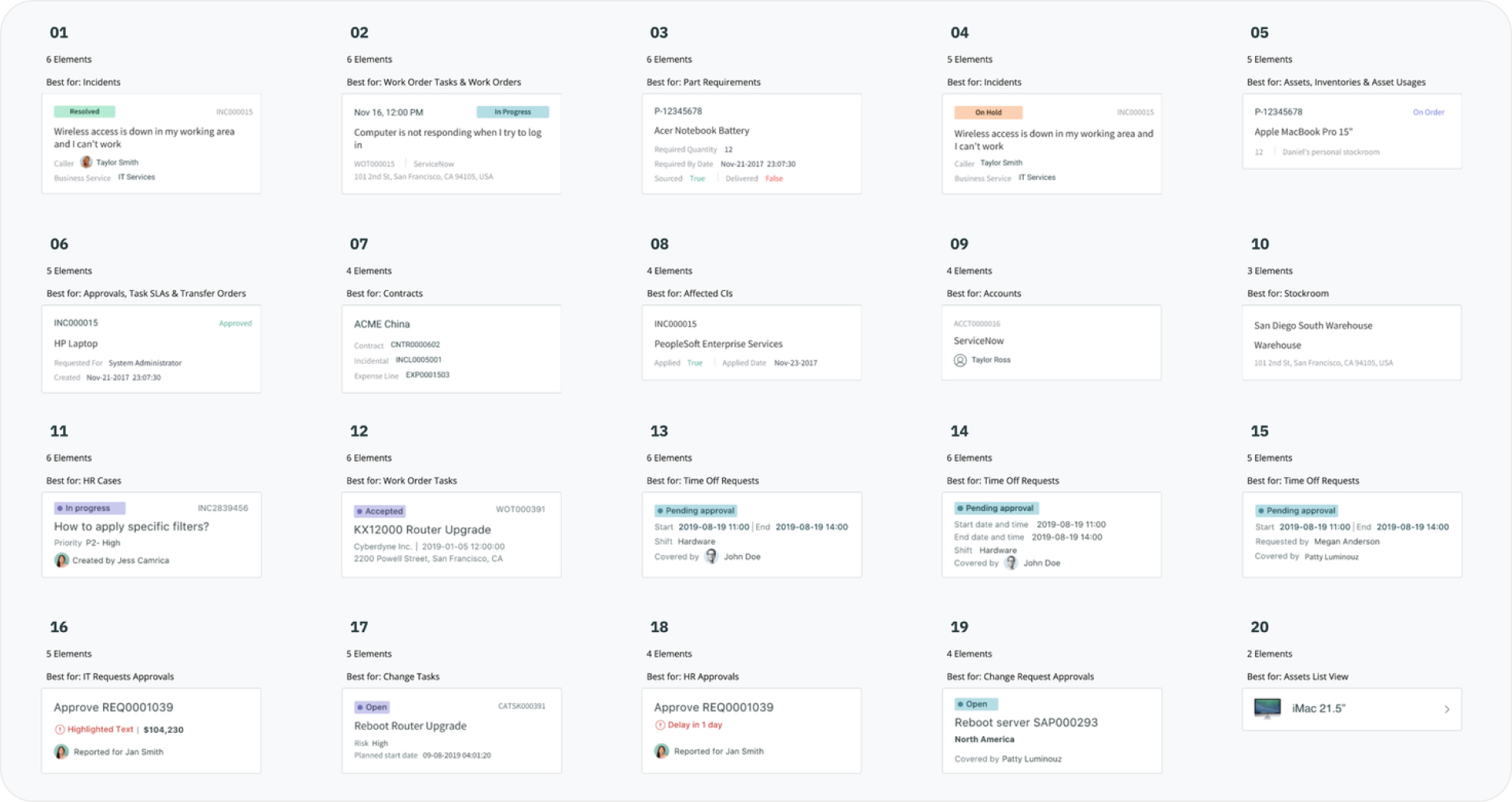 Each pattern is tailored to suggested uses.
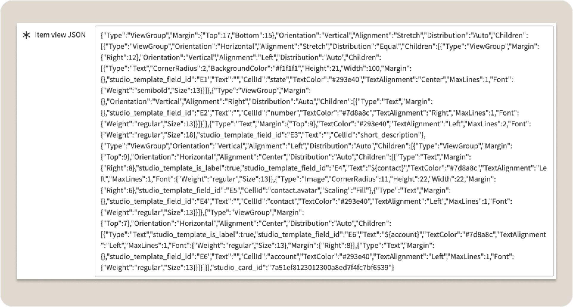 Despite the wide selection, users may still choose to customize what’s provided OOB. They’ll leave the tool to go into system records and modify JSON meta data.
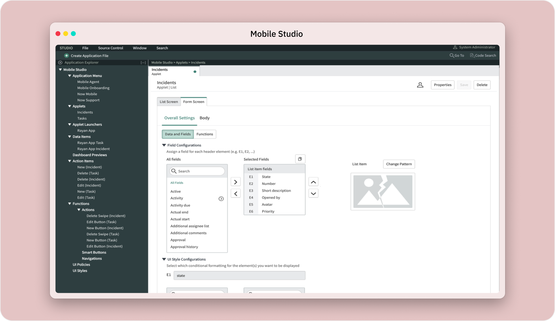 Upon returning to Mobile Studio, the pattern is broken. Any changes to this page configuration will override any manual updates in the system record, losing precious work. This is a P1 bug.
What I saw
The team responded to the P1 by shipping 40 more predefined patterns, doubling the pattern library to 80. ServiceNow Developers had more options to choose from, but they didn't want more choices -- they wanted to build their own, and it seemed no amount of presets were going to close that gap.
I read this as a missing product feature. I first tried to close the gap inside our existing mobile configuration tool, but it had real limits on how good a configuration experience it could offer:
- The app shell took up a lot of real estate, and our team didn't own it. It was designed to be schema-centric, and we couldn't change anything about it.
- The design system was limited for a builder setting, and a custom WYSIWYG interface inside the tool went against its guidelines and quality bar.
- Application scope management lets developers protect certain files and data from being overwritten by accident. Mobile platform development means working across many application scopes at once to bring everything to a mobile app client, yet the IDE hosting Mobile Studio didn't support scope management, which sometimes blocked developers from making progress in the tool itself.
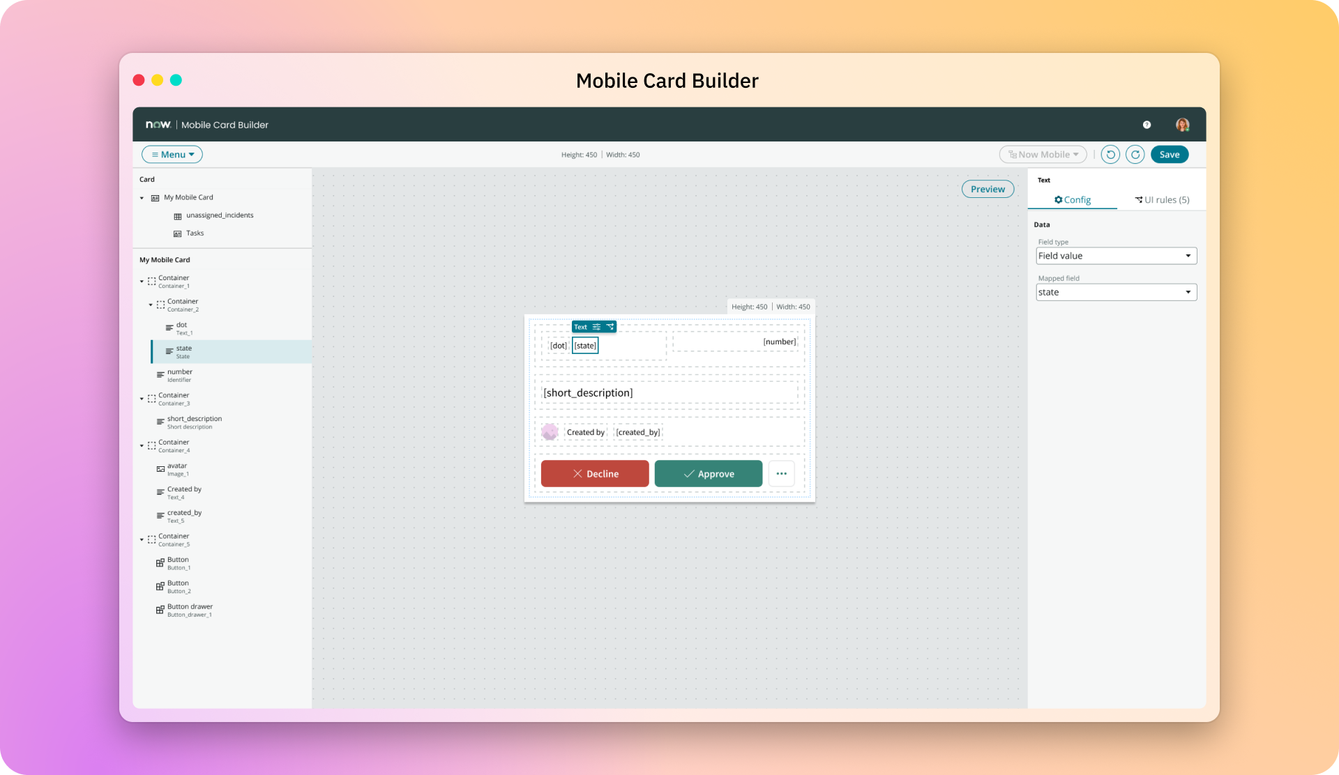
So I proposed a small WYSIWYG card builder on a newer, proprietary tech stack instead. I modeled it on the card's actual data structure and put it behind an API layer, so the refactoring underneath wouldn't reach the people using it.
[Image: dev-mobile-tech-stack.png] The code was using API calls that allowed us to worry less about underlying changes.
Mobile Card Builder would simply fix the P1 bug, but I also had a second reason for pitching it, and I told the team up front. I wanted to see if we could take something new from 0→1 on the newer tech stack. If we pulled it off, I'd have the proof I needed to pitch rebuilding the whole configuration tool to be a WYSIWYG builder.
Who I pulled in
Mobile Card Builder was built by 2 engineers, a PM, and me, running our own daily morning standup so we could iterate quickly. We had no researcher, so I put working builds in front of developers in the office and watched where they got stuck.
Six weeks in, the team was split on the card's interaction patterns: how you select an element, when the add signs appear for new elements, what the toolbox looks like, and whether live preview should be the card itself or sit in its own pane. We'd gone back and forth for two weeks. I hand-coded a working prototype over a weekend in HTML, CSS, and JavaScript. Under real interaction it exposed rendering times and model trade-offs, and gave engineering something concrete to work through. Experiencing the interactions settled it within minutes.
We chose a separate preview pane. Previewing live data showed how well a card held up once it rendered, like when a title string ran too long or an avatar was missing.
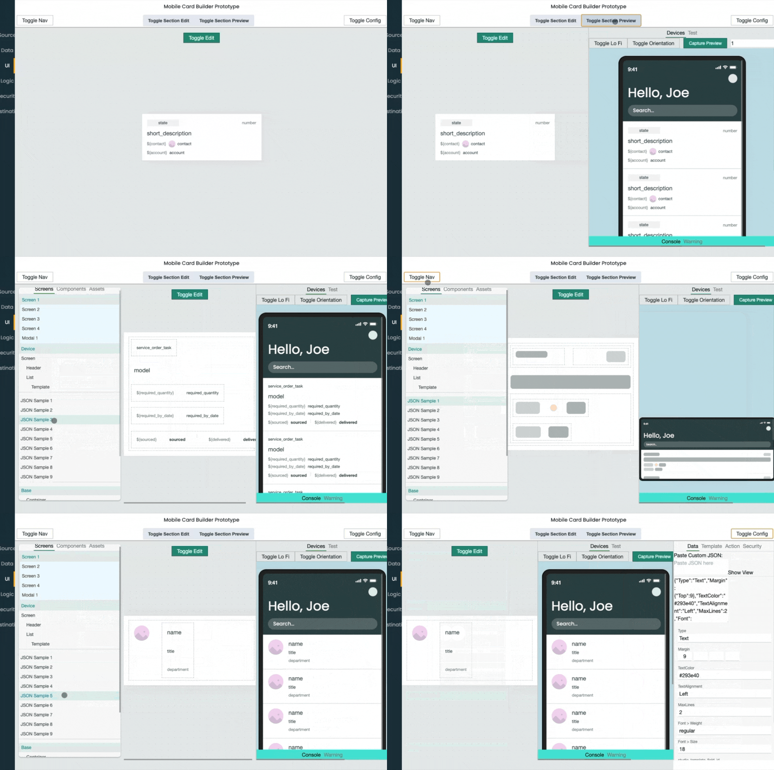 This was my hand-coded prototype in 2019, well before AI generators existed.
The prototype outlived the debate. It rendered the card schema live, which made it the clearest explanation of how cards actually worked, and I shared it with the team building the platform's web page builder (UI Builder).
What changed
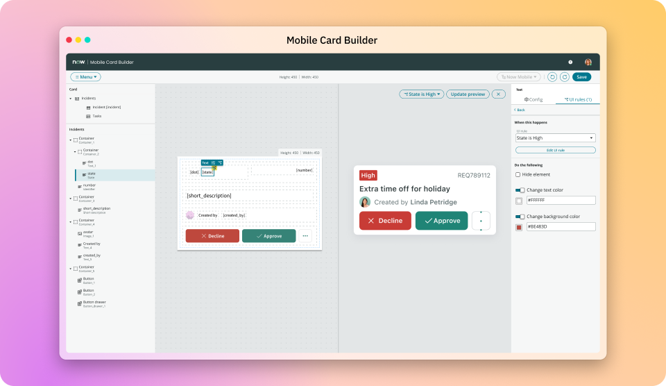
Shipped Mobile Card Builder in 6 months on its original scope, cutting card configuration from 75 minutes to 16 minutes, and taking pro-code development out of the path.
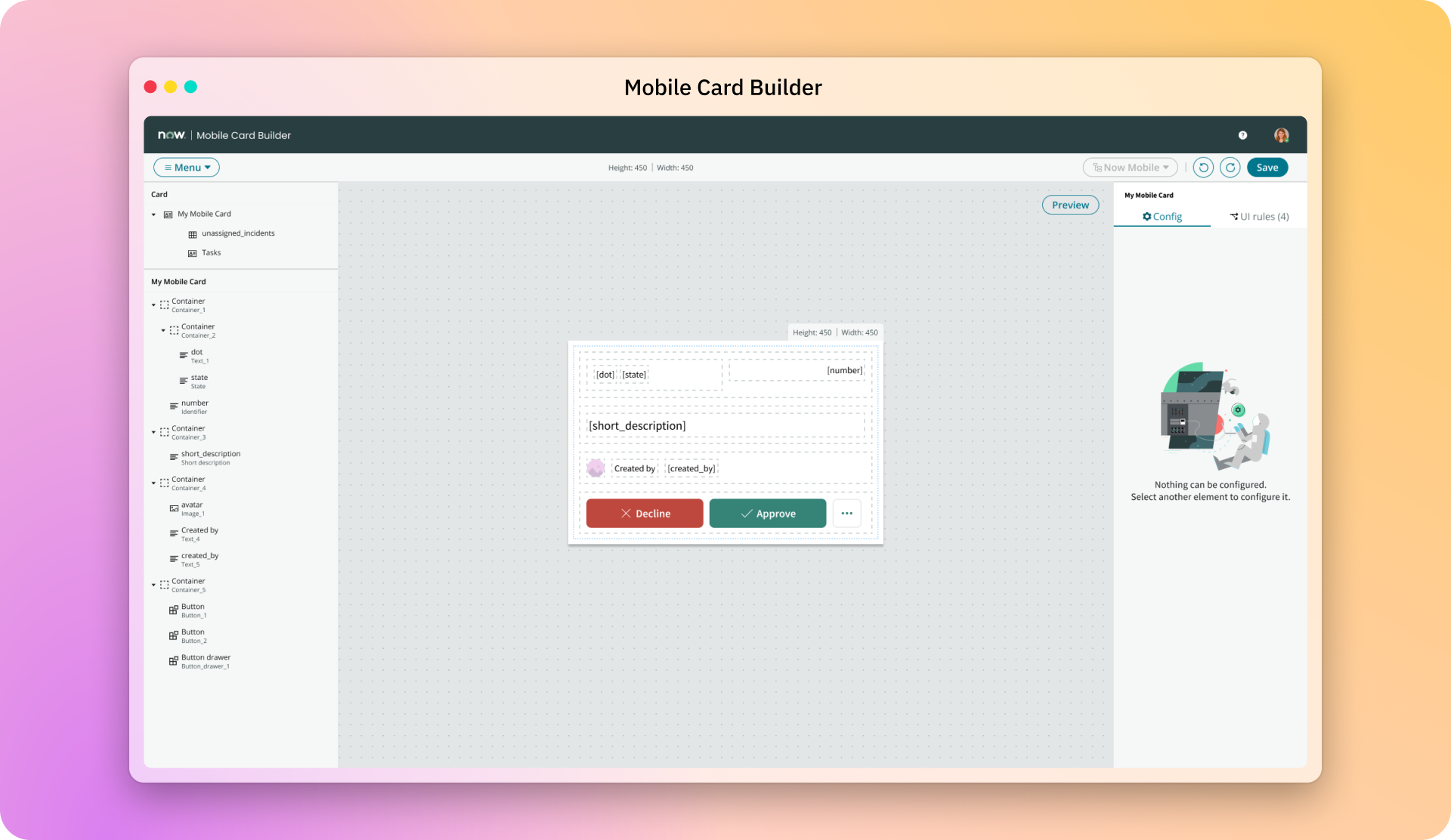
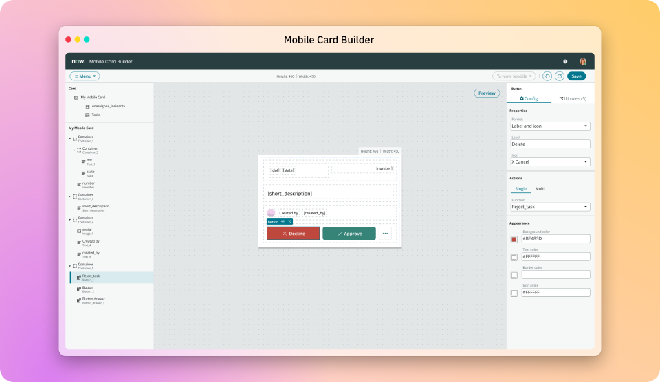
Built the property panels, live preview, and publish flow that became the template every later mobile builder inherited.
Turned a release cycle spent absorbing breaks into a quarterly cadence the later new builder products shared.
Turned the question of what came next from another point tool into a rebuilt mobile configuration tool, with Mobile Card Builder as the evidence I brought to propose it.
What it left open
Mobile Card Builder fixed the card. It didn't fix the end-to-end workflow tool . The confusing information architecture and insider terminology from that first evaluation were still real lingering challenges for our users, and developers still had no way to learn the platform inside the product.
It also didn't change who owned what. The schema, the patterns, and the refactoring still sat with three different teams. The API layer made that survivable for one builder, not for the whole platform.
What I'd tell a leader facing this
When the fix for a bug is "more of the same," look for what's actually missing, but test the existing product's limits before suggesting a new product. If a new product really is the answer, don't ask for the big bet first. Ship the small one that proves that the tech stack, the team, and the experience can hold itself up. Then, use that product to make the bigger bet argument for you. Tell your team it's doing both jobs, so they can make low-cost architectural decisions now that leave room to scale later.
When your team keeps going back and forth, stop describing the options. Build the one thing everyone can touch.
And weigh the cost of shipping something new. A new builder made sense at the time, but I later learned that ServiceNow Developers had product fatigue. They didn't want another tool to learn. They wanted the existing ones fixed, or better -- one place to do all their development work without swivel-chairing. That's where Part 3, Builder Bridges, comes in.
Next: Part 2 — Mobile App Builder → Card Builder earned the case for a bigger bet. The next question was what to do when that bet's estimate nearly tripled.